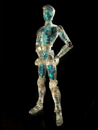
Why is this my favourite panel from Stickleback? Read on to find out...
Stickleback © 2007 Rebellion/2000AD
Created by Ian Edginton & MeComics is an unsteady business; there are any number of obstacles to getting a project published, so much so that I only half-joke that I'll only believe a project is going to happen once it's finished, published and paid for.
Under those conditions,
Stickleback: Mother London is pretty much* "real, " and I think I can look back and feel that it's gone okay. I took a big risk with
Stickleback; the previous "black & white & grey" technique I’d used on
Leviathan had gone down very well with
2000AD readers , but aside from the fact that I felt I'd done all I wanted to with it, a number of other artists were now using the technique in
2000AD; the look was no longer strongly distinctive. Nevertheless, there was no guarantee that the readers would take to something new and different.
*due to Rebellion's payment cycles, I don't expect to be paid for part 9 for another week or so. Such is freelance life.Second, a change of look means a change of method. I'd been doing the
Leviathan technique for four years, and had it down so pat that I churn pages out like sausage links from a machine. Due to all sorts of stuff happening in my life, I ended up starting
Stickleback two weeks behind, using an untested technique that was radically different from anything I'd done before. I had no idea if this faux-
Brecchia collage technique would be quicker or slower than my old methods; luckily it turned out to be slightly quicker, but things could just have easily gone the other way, and then, boy, would it have been Rigellian hotshots all round...
The obvious difference with the
Stickleback stuff is the inclusion of the wild and wacky surface textures, but for me, the really big change was in the way I thought about the drawing. Most of my professional work before
Stickleback belongs to what I'd call a
representational tradition in comics; that is, artists who try and include detail in their drawings, to create a sense of a complete world within their work.
 Simple but telling; Hergé re-drew key background details
in The Black Island to create a more accurate sense of place.
(Image pinched from www.tintinologist.org)The classic example is Hergé, author of
Tintin; though his drawing style was cartoony and simplified, he was famous for his use of background detail to create a sense of place - indeed, he went back and re-drew some of his earlier stories once he had the time and resources to research them more thoroughly. Other artist who I'd place in this category (and who have influenced me considerably) are Jack Kirby, Mike McMahon, Mœbius, Geof Darrow, Dave Gibbons, Don Heck, Enki Bilal and Kev O'Neil. With the best of their work these artists give you a sense of looking in through the window of the panel border to a complete world; you get the feeling you could peer in around the edge of the drawing and there's be more stuff to see.
 From Elektra:Assassin written by Frank Miller, art by Bill Sienkiewicz
© 1987 Marvel Entertainment, Inc
Contrast this with work from the
expressionist tradition of comic art; exemplified in the last twenty years or so in the English-speaking world by Bill Sienkiewicz. Expressionist comics tend to focus on the human face and figure, while backgrounds are simplified, often becoming mere smears and whorls of paint. Spacial relationships are unimportant; for example, in the panels above we have no idea where the two characters are in the room, or even where they stand relative to each other. Mood and atmosphere, however, are
very important; dramatic lighting plays a key role (contrast the Sienkiewicz page above with the Hergé panels; the latter contain much more background detail but no shading at all.) The actual surface of the drawing or painting itself is also a big part of the experience; the expressionist artist wants you to notice that the painting
is a painting, and appreciate it as such.
In one way, Bill Sienkiewicz differs quite profoundly from the other comics expressionists who came after; prior to his reinvention as an innovator, he'd spent years at the coal-face at Marvel, pencilling monthly superhero comic books. This experience gave him a terrific grounding in the mechanics of comics storytelling, and it shows; however wild his work may appear on the surface, mixing painting, collage, photo-reference and pure cartooning, he always makes sure the story is served. Indeed, I believe Sienkiewicz's greatest innovations have been in his incredibly imaginative and lateral storytelling solutions, a subject that deserves an article of its own.
Many of the artists who followed on from Sienkiewicz* came from outside comics, and they tended to be weaker visual storytellers. Their working methods tended to be similar. They produced fully-painted comics in which the figures were based closely on photographic reference or life drawing, with minimal backgrounds, and gaps in the visual storytelling being carried by dialogue and captions; if done well, the 'realistic' appearance of the photo-referenced figures was compelling enough to carry the reader through the story. In this category I'd put Jon J. Muth, Kent Williams and the earliest works of Dave McKean (
Black Orchid in particular, also
Arkham Asylum).
*I don't suggest that these artists were directly inspired by Sienkiewicz, but I believe his success gave them a market within the comics industry.Possibly because it is very difficult to do and expensive to reproduce (and also because artists who can paint that well can make much better money in other fields), this expressionist painted style has never become the norm; these days, the only comic artist I can think of who still works on regular series in this way is Simon Davis at
2000AD (Sinister Dexter) and
The Megazine (Black Siddha). A number of other artists followed Dave McKean's ground-breaking move into digital production; Mark Harrison and Clint Langley spring to mind.
For me, starting out in the late 1980's, all this was very exciting and new, but after some dabbling with paint I realised my strengths lay elsewhere; ironically, it was after going to a lecture by Dave McKean that I decided to go boldly down the representational path. The decision must have been right: the strip I was working on at that time ended up becoming the first episode of
Timulo, my first regular professional series (for
Deadline magazine).
And so I followed a pretty straight path from
Timulo through to
Scarlet Traces: The Great Game. I always had a hankering to try something a little different though, especially after a stint colouring advertising storyboards in 2002-3 brought me to the stinging realization that I really am
not a painter. Put simply, I'm fine putting colour under ink drawings with the solid blacks already established; without the outlines and spot blacks as an anchor, I can't work out how or where to place the dark tones in a painting, and the result is always a bland mess.
 From Perramus by Juan Sasturain & Alberto Breccia
Perversely, my inability to deal with painting
sans black ink outlines made me determined to find some way of doing just that. After faffing around with all sorts of things, I realised that the painted collage work of Alberto Breccia might well hold the key. I've
written elsewhere about how Breccia's technique was based on chiaroscuro ink drawing, and remains very graphic (hard-edged) despite being painted; this provided me with an idea of drawing hard-edged areas and then working into them with texture and (virtual) brush strokes later. I'm not sure if that last sentence will make sense to anyone but me, but the result is that I could paint without having to
think like a painter.
The next question was what to do about the drawing; this painted technique did not allow me to add as much fiddly detail as simple line drawings (though the combination of texture and tone gives a similar visual density to the pages). This solved a problem I'd been worrying about for some years, namely that I was using detail to cover up other deficiencies in my work. I'd felt for some time that I needed to loosen up a bit and try to make my work more dynamic; this method would force me to do that.
 Left: José Muñoz's New York from Alack Sinner
Right: Book cover by John Glashan At the same time, I didn't want to completely throw over the sense of place that had existed in my work to date. Although pretty expressionist in approach, Breccia was not above adding significant background detail, so I knew it could be done. Also inspirational was the work of Breccia's one-time assistant José Muñoz, whose portrayal of New York in the
Alack Sinner stories showed that a sense of place could be generated without recourse to conventional perspective. Finally, the work of cartoonist
John Glashan (a favourite from childhood) showed how implied architectural detail could be built up using the loosest of drawing.
 The Greek Orthodox Cathedral of Saint Sophia
Architectural fun from Stickleback Part 6
Stickleback © 2007 Rebellion/2000AD
Created by Ian Edginton & MeI first put these lessons to use in the views of London in
Stickleback: Mother London part one. The success of those panels gave me confidence, so by the time I needed to draw the Greek Orthodox Cathedral of Saint Sophia in part six, I was pretty sure I knew what I was doing. But it was the crowd scenes in the orgy in part eight that convinced me I hadn't had to let anything of myself go in order to embrace this new method.
I'd also worried whether the painting and texture would overwhelm the drawing, particularly if it would make things like facial expressions harder to manage. In fact, the reverse seems to have been true; I think I've made the characters in
Stickleback emote much more than characters in previous stories.
The tendency of the expressionist method to push the characters to the fore served the story well, too; there's a whole episode of
Stickleback in which Bey and Chipps just sit in a pub talking, something which wouldn't have looked half as interesting drawn
Leviathan-style.
The question now is, what next? Stickleback has been very well received, but I don't want to be a Breccia copyist for the rest of my career. I also don't want to rest on my laurels; if I repeat this style for the next twenty years it'd be just as stale as repeating anything else.
My thinking at the moment is that I don't want to throw over this style right now, especially as it's still bedding in. Simply by working away at another series, it'll continue to evolve into something that's more and more "me." Rather than worry about the surface finish, I think I want to work seriously on my drawing and page layouts in the next series.
That, of course, applies to any future series of
Stickleback; in other work I can follow whatever style I wish. For the adaptation of
Murders On The Rue Morgue I mentioned a while back, I've gone right back to basics, largely to reassure myself that I can still deliver the goods without all those fancy-schmanzy special effects (more on this later). Similarly, the
Fables strip I did in January was just black & white line work (to be coloured by DC).
 Anyone who knows my work would probably not be surprised to learn that I'm a big fan of David Lynch. What's more, the stranger the Lynch the better; never mind yer namby-pamby weak and watery Twin Peaks, my favourites are Eraserhead, Lost Highway and Mulholland Drive.
 Finally, and most disappointingly, Lynch seems to have lost the knack that really held his films together - that, however bizarre or irrational they became, from moment to moment there was a fascination in watching them that carried you through. This last was particularly noticeable after I went to see Eraserhead at a late-night showing at The Cameo; in under 90 minutes it took me on a journey that was more compelling, beautiful, troubling and satisfying than Inland Empire managed in twice the time.