By the time we get to issue four, the whole thing's really got into gear, and I'm having more fun stuff to draw than you can shake a stick at, but out of the final ten pages I won't really be able to preview anything without it being a massive spoiler. It's like having big news at last but not being able to tell anyone...
Instead I've decided to show off some stuff from issue two; I've already talked about the fun I'd had designing the rocket trip to Mars, and showed some preview images. This is a step-by-step showing how one of those was put together.

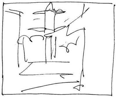
Original scribble thumbnail sketch of the panel from my layout book;
the only part of the process I do with paper and ink.
You may just be able to make out a rocket taking off in the
background with another in the extreme foreground.

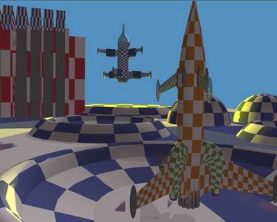
From the sketchbook drawing I build the models in CGI; at this point I've
decided to pull back a bit so you can see more of the foreground ship.

I decided to alter the page layout, so the proportions of the panel have
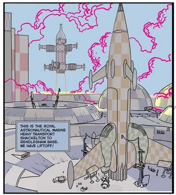
changed. On computer (using Adobe Illustrator) I then traced off a
quick rough to show Ian the writer and our editor, Dave de Dark Horse.
Lettering has already been added.

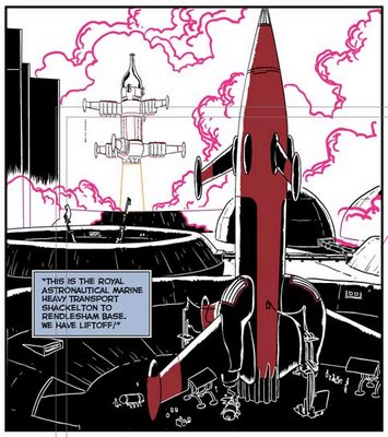
Intermediate inks showing how I trace from the CGI (and how much
I add by hand.) The chequer pattern on the models helps me add hand-
drawn detail in perspective.

Finished inks, showing spot blacks. I've also added the red trim
on the rocket at this stage as it's hard edged and easier to draw
in using Illustrator than "paint" in at the colouring stage.
The pink lines are for elements (in this case smoke) that will be
painted in later. These lines will be deleted when done with.


5 comments:
Hey
That colouring is amazing; I frequently have to colour illustrations and I recently had to attempt an explosion - no way near as good as what you did. Was that the influence of Corel Painter?
Dave
Yeah i agree with Dave there. Great colouring. B)
Wonderful. Great breakdown of the process too.
WOW!! AWESOME!
Smithy, "INJ," Alina - cheers for the kind comments.
Dave - It's certainly an attempt to make computer colouring look more like real paint, though this panel was coloured mostly in Photoshop - I used the hard-edged Pencil tool for most of it, then softened some of the edges in Painter with the Grainy Blender brush (Painter's Blender brushes let you squoosh existing colour around as if it was paint or crayon; the Grainy Blender makes the colour squish as if it was chalk on rough paper). I'm so much more familiar with Photoshop that I find it much faster to block in colours with Photoshop and then finish off the shading in Painter, mostly using different Blenders, Chalk and Acrylic Dry brushes.
After thrashing around with technique for most of Great Game #1, I settled on this method for blasting out War of the Worlds, and stuck with it through Great Game #2-4.
Post a Comment