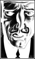
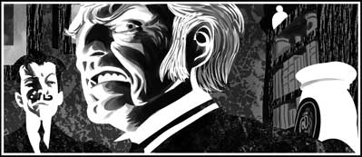
 Just wrapping up part 4 of Stickleback today; I hardly feel as if I've started, yet by the end of the next episode I'll be past the halfway point.
I feel as if I'm really getting a handle on the new technique; when drawing comics it's not enough just to be able to do something, it's important to do it in the quickest and most efficient way, since you're effectively working on hundreds of individual drawings (c0mic panels) in a short time. Stickleback will contain somewhere between 300 and 350 panels by the time it's done; a figure that took me aback, as I tend to think in whole pages. Not bad for four months' work.
With its textures and tendency to favour dramatic lighting, the new technique certainly makes it easier to keep pages that consist of nothing but conversation looking interesting; I wondered if it would be more difficult to render facial expressions, but if anything it seems to help a bit. It's also encouraging me to play off simplicity against complexity and use design a bit more. I produced a few non-spoily panels that I was quite pleased with, so I thought I'd share.


3 comments:
Love the textures, but particularly love the big white shapes, the almost glow.
These are gorgeous!
Despite the difference in approach, I've been pleased at how the tone of Stickleback matches that of Leviathan. I think it's down to the use of grey; I tend to use levels of grey from 50% (mid-grey) through to black, against pure white with a minimum of lighter greys. The contrast is what makes the whites "pop."
Funnily enough, I got the idea from the world of music; I once heard the composer John Barry (best known for James Bond themes) say his sound was so distinctive because he contrasted low base notes against a high-pitched melody, omitting the middle registers.
Post a Comment