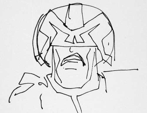
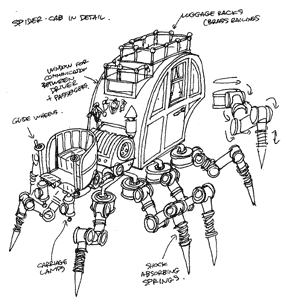
So said Harry Harrison,* and it's a thought that often springs to mind when I'm working on a script by Ian Edginton.
Now don't get me wrong; Ian's not one of those writers who write impossible panel descriptions, (
"A thousand indians come over the rise, each one wearing a wristwatch showing half-past three. The cavalrymen have turned away from us to look at them. Their faces are grim. Oh, and by the way, this is the first of sixteen panels on this page and there are four large blocks of text in this panel ) in fact Ian's scripts are so challenging precisely
because he has a great sense of what will fit on the page. He also has a wonderful visual imagination (possibly better than mine), and a determination to push me to my limits. With every batch of script I get from Ian, I know there'll be one page in there that will make me go "Oh f*ck, how do I draw that?" but I also know that dreaded page will be the best thing in the book. Look at my most memorable images (the charging teddy bears from
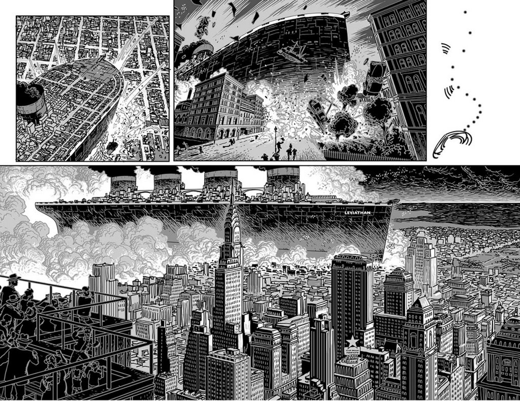
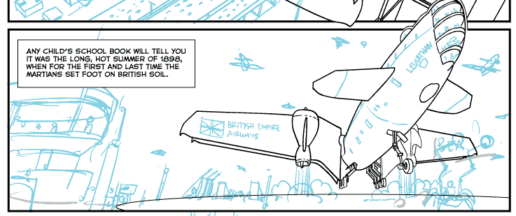
Kingdom of the Wicked or the beached mile-long ocean liner from
Leviathan ) and you'll see Ian's handywork.
(Sometimes he admits he purposely sets me something complicated to draw when he's behind with script and he needs to keep me quiet for a bit - sort of Calpol for the comic artist)
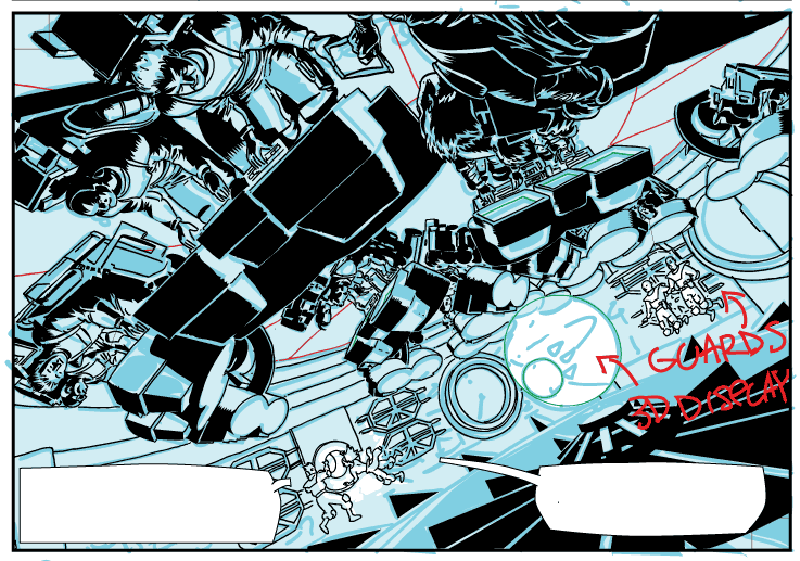
When you get a script, some things leap off the page as being difficult or time-consuming; others sneak up on you, and yet others just balloon in complication until you keep finding things you've missed every time you think you've finished. Part three of
The Great Game contains a sequence set in an abandoned alien city; there are big set-up shots I knew would be complicated (especially with my mania for drawing architecture) but the surprise hold-up was on a smallish panel showing an empty refectory. All those chairs and tables, you see.
In perspective.
You'd think that drawing a room like that would be quicker if it's not full of people, but the opposite is true; if it's packed full you can pick an angle where the people in the foreground obscure much of the background, and just
imply that there's lots of stuff behind them. If there are no people, there's nothing for it but to draw lots of chairs and tables.
In perspective.
(Confession time - actually, like many of the backgrounds and vehicles in
The Great Game, I built the room in a 3D modeller and traced off from the rendering; though by the time you've done that, it's no quicker than plotting the perspective yourself, and the inking still has to be done by hand.)
 Four stages of the accursed refectory panel; Top left: CGI rendering, top right: rough (for editorial approval), bottom left: inks traced by hand from CGI rendering, bottom right: final coloured version.
The current page I'm working on in part 4 - and here I have to be careful not to give away the ending of the story - features a rain of small, liquid-filled glass globes onto the surface of a planet. The globes burst on impact and liquid splashes out. Luckily, my drawing programme (Adobe Illustrator) has a neat feature called "symbols" that lets me make a single globe and then "spray" hundreds of copies of it onto the artwork. The copies can be shoved around or scaled, and they remain tied to the master drawing, so when I decided they all needed more highlights on them (or different highlights to match the lighting in different panels) I only had to edit one master drawing and all the little copies updated themselves to match. Neat. And in this mood of self-congratulation I was just about to wrap the page up when I had a horrible thought.
On the last panel on the page, the big, dramatic, half-page panel, most of the globes are meant to have hit the ground and smashed. This meant that everything in the panel should be covered in little paintball-splats. And by "everything," I mean tanks. Lots of tanks.
In perspective.
Still, now that the cursing is over, the page is put to bed and my RSI has stopped twingeing, I have to admit that, as per usual, that page is probably going to be the best one in the whole issue. I say "probably" because I haven't got all the script for this issue yet, so there may be something even more baroque lurking in wait for me.
And if so - well, I'll curse, but in the end, the issue will be even better, and that'll be no bad thing.
You do, after all, have to keep these things.
In perspective.
*from Mechanismo, Reed Books 1978, ISBN 0 89169 504 4.
*u
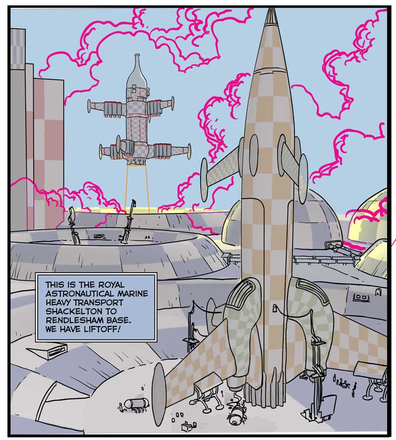
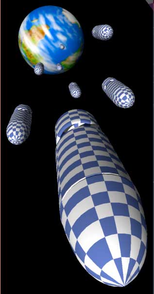 It's funny what can prove difficult to draw. Cylindrical spaceships, for example, should be pretty easy, except try making them look interest- ing... the only way to get a bit of dynamism is to use fairly strong end-on perspective, and at that point, getting them to recede convincing- ly can be a bit tricky... they're so simple, you see, there's nowhere to hide your mistakes.


